Monday, November 4, 2013

Cat 52


(above: rework 3 years later)
Cat 52, Oscar on the bed
Acrylic on canvas. 11" x 14".

This has got to be the "girliest" looking  piece I have ever done.

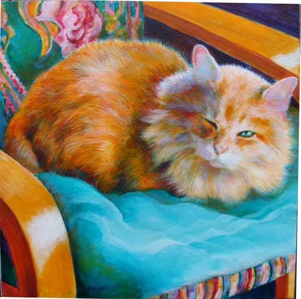
The woman who moved into the room my father had occupied came with a large senior cat named Oscar. She has arranged and decorated the room very differently from how my father had it set up, which makes it a bit easier for me to visit there. The room looks quite feminine now and Oscar, weighing in at 19 pounds, looks a bit incongruous lounging on her pink coverlet. So much for Oscar's tough guy image.

This was an interesting challenge with all the bright, saturated colors. Initially I had left the patterns very loose, but that looked odd with the cat being detailed, and I ended up going all fussy with the quilt.
I liked all the angles and the concentrated patches of color on the left, and the visual relief of the more solid area on the right. Initially, the image was very flat with the saturated colors, and adding darker areas didn't help to establish much depth. The solution was to tone down some bright areas by mixing gray into the colors. The broad area of pink did not incorporate in until I thought to add some yellow into it, which finally pulled it together.
I tend to isolate colors which can result in a fragmented, disjointed appearance. Integrating the colors gives much better unity.

Wednesday, October 30, 2013

Raging River Bridge No.1008E, version 3

Raging River Bridge No. 1008E, version 3.
Acrylic on canvas. 16" x 20".

Another view of the bridge, standing downstream on the north west shore, looking up at the bridge with a lot of interesting reflections bouncing off the water, illuminating the underside of the bridge. To get this shot I had to slide down a steep clay hillside off the end of the bridge, and walk through a dry creek bed. Later I discovered I had been tramping on private property. Oops.

This time I tried drawing my guidelines on the canvas using a medium blue dry pastel, and this worked well. Any lines I didn't want were "erased" by brushing over them with a dry brush. The rest of the lines disappeared as I applied thin washes of paint.

I thought my focus would continue to be the trees, but the reflections bouncing all over were too enticing.
I will probably fiddle with this a bit more after I step away from it for a while. There are areas I think are weak and need to be resolved- some of the reflections around the large boulders aren't reading correctly to me; some of the boulders need to be tweeked and the stand of alders in the distance are disappointing.  They are just too vague.

Tuesday, October 22, 2013

Raging River Bridge No.1008E, version 2

Raging River Bridge No. 1008E, version 2.
Acrylic on canvas. 11" x 14".

Another view of the bridge, standing on the south upstream side, down on the river bed. The water level is very low this time of year, exposing rocks. Some of the rocks were clearly cut and set in place, others are naturally occurring, worn smooth from the action of the water.

On this painting I made a point of putting away all the smaller detail brushes I normally reach for, and started with relatively large, coarse brushes. I had a couple objectives. I want to improve my skill rendering trees and foliage in a more convincing manner, and push to work "looser", making use of directional brush strokes.

While the photo I took looked fine, I found this a difficult composition to work with. The centered bridge immediately dominated the canvas. At one point I had a lot of detail on the bridge mass, but found that created a discord with the rest of the image. It did not make sense to have extreme detail on an object further back. In the end I scrubbed most of it out and let it go soft focus again. I'm afraid I ended up overworking everything, and it lost some spontaneity.

I am pleased with the handling of the trees and foliage. These are looking softer and more impressionistic than previous attempts.
I'm dissapointed with how I handled the rocks in the foreground, but at a loss at what to change.

Tuesday, October 15, 2013

Raging River Bridge No.1008E

Raging River Bridge No. 1008E
Acrylic on canvas. 11" x 14".

This bridge is about a mile and a half down the road from my place. I stopped by the other day and toured around it with my camera. Ended up becoming obsessed with the bridge and had to paint it.

The bridge was completed in 1915 on was was then called the Sunset Highway, the road from Seattle over Snoqualmie Pass and all points east. It was also referred to as "the Yellowstone Trail" by early promoters in the area, although following the road east did not directly end up at Yellowstone.
Years later this two lane circuitous road to the pass was replaced by a straighter route a few miles to the south; interstate 90 in use today.

After 1940, this section of the former Sunset Highway became a local access road between two small towns. The road was straightened at some point, leaving the old bridge marooned on what became a side road which dead ends shortly after the bridge. A road and bridge to nowhere.
It doesn't look like much from the road bed, but has a very elegant early art-deco look from the side, standing below by the river.


Monday, October 7, 2013

Cat 51

Cat 51, Cat on a Blanket
Acrylic on canvas. 16" x 20".

I approached this painting with the thought of keeping it "soft", consciously staying away from hard edges. And promptly violated that by introducing a tiled floor in the foreground. I liked the tiles but they really didn't fit with my objective, so I scrubbed and scrapped most of the paint off, and added in the blanket. I like the contrast of the sharper blanket edge with the rest of the image softer.

I've been thinking about my vision, having been recently diagnosed with pre-glaucoma stage symptoms, a condition inherited from my mother who has since gone blind. I'm noticing my paintings tend towards hard edges, maybe compensation for the world appearing a bit blurry?

I had terrible vision as a child. Being fairly well behaved through school, my seating assignments were towards the back of the classroom whereas the troublemakers were placed in the front where the teacher could keep a better eye on them. By age seven I recall puzzling over what the teacher was writing on the chalkboard at the front of the room- it was usually a pleasant blur. That's about the same time my grades in most subjects began to suffer noticeably. Mom used to constantly admonish me, "STOP SQUINTING!", but it wasn't until I was eleven that an official eye exam revealed that I couldn't make out details past a foot or so from my face.

Friday, September 13, 2013

Cat 50

The painting (above) reworked a few years later, as "Cat 61".

Cat 50, Lizzy on the bed.
Acrylic on canvas. 14" x 11".

Lizzy cleaning up, on the bed. She probably spends half her waking hours cleaning herself, which I find puzzling as she does not have an opportunity to get very dirty, being an indoor only cat. I saw her once covered with cob-webs, after she managed to squeeze in behind the washing machine one day. Not sure what she was looking for back there.

I seem to do 80% of a painting in an hour or two, then spend two weeks fussing around adding and removing layers. Here I was looking for a more complex, twisting position to tackle and this looked promising with the nice diagonal lines. It turned out to be one of those shots that looked believable as a photo, but a little weird to reproduce as a painting. I bypassed a lot of elements which just ended up looking strange when I tried to include them. Looking at it now I'd like to see the paws were more "anchored" to the ground- maybe have more shadows worked in. I will likely go back in and look for a good solution later on, after I've stepped away from it for a while.
I like the warm tones. Using some cooler violet and blue in the shadows worked well to contrast with the warm hues and intensify them.

Wednesday, September 4, 2013

Cat 49

Cat 49, Don Gato.
Acrylic on Masonite. 12" x 12".

This is Don Gato, a one-eyed cat, on a towel covered chair.
 I liked the intensity of the orange cat on a turquoise towel, but had a difficult time trying to achieve the turquoise color. I tried numerous mixes of blues with other colors, and ended up wiping them off and starting over until trying an old, almost dried out tube of Pthalo green. That did the trick, although the paint was a little too compromised to work properly. I was able to coax enough pigment out to get a workable tint, but could not manipulate the paint very well. I also had to truncate his body a bit to fit into a square format.

After weeks of intense projects, appointments and obligations, I'm finally getting back into painting again. With the relatively short window of dry, warm weather, any major outside projects have to be accomplished during the brief summer months. Roofing, painting and other house repairs left me drained to do much else.