Showing posts with label Cats. Show all posts

Thursday, August 29, 2019

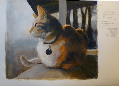
Cat 70

Cat 70, Lizzy
12" x 12", acrylic on board

From a shot taken in 2012. This painting was fast, and I didn't over fuss it for a change.
Again with the goal of softening edges, and brush strokes showing. Worked with the three primary colors: ultramarine blue, cad red light and cad yellow light. And White.
I like the softer approach of neutral colors and lower contrast, with only a few detailed lines.


Tuesday, August 27, 2019

Cat 69 Lizzy in the studio #2

Cat 69, Lizzy in the Studio #2
9 x 12", acrylic on board

Using the same photo reference as the previous painting. In a vertical format instead of square, and the color base is blue and orange (mix using cad red light & yellow light).
This was a response to the ongoing struggle with #68. I wanted to try a different approach, working with a more neutral pallet. Drawing with the paint using a filbert shaped brush resulted in a looser line quality. Still a little rigid, but heading in a good direction.


Friday, August 23, 2019

Cat 68 Lizzy in the studio #1

Cat 68, Lizzy in the Studio
12 x 12", acrylic on board

From a shot taken in 2011. The idea was to work "looser", let brush strokes show, and have softer edges on the forms. I used a limited palette of red and green as the base colors, modified with white and blue.

I puttered ineffectively for months on this. I neglected to get the proportions and the placement on the board correct to start with- I automatically plop the subject in the center.
And then, I was reluctant to paint over the (very) few areas that I was happy with.

I shelved it for a few months, pulled it out to work on it again, and finally threw in the towel and painted over the whole darned thing.

Lessons learned:
Make better choices when selecting a photo to work from and pay attention to the crop & composition.
Sometimes walking away from a problem painting for a long time can be very enlightening.
 And if it's clearly bombing, it's best to stop and make a fresh start.


Monday, December 31, 2018

Cat 66, Tiger on the porch

Cat 66 Tiger on the porch
acrylic on canvas, 12" x 16"

   Once again I reverted to the bad habit of getting too involved in details before establishing the basic structure and had to put this painting aside for 2 months to come back with a fresh eye, and the courage to paint over some nicely executed- but poorly placed- brush work. Ack!
At least it's getting closer to what I want to see.
 Not really done with this yet- I intend to work on the right side of the painting. Still can't paint trees/foliage. Who knew it would be this perplexing?

What I intended to do:
1. Work out the composition in thumbnail sketches before picking up a brush.
2. Work with a very limited palette.
3. Establish the large forms in terms of value patterns.
4. Utilize warm and cool colors
5. Sculpt the shapes with the brush.
6. Add details at the end.


Sunday, March 25, 2018

Cat 67 Mrs R

Cat 67, Mrs Roosevelt on the porch
11 x 14", acrylic on canvas

Mrs R has been gone well over 15 years, but I have plenty of photos of her. She was not particularly attractive, but had a dynamic personality that more than made up for her looks. I may have glamorized her a little bit- she would be pleased.

I had two objectives with this painting:
 arriving at a good composition for the canvas shape, and,
 working with warm and cool temperature colors to convey depth of field.

I'm finding the standard canvas dimensions often do not work with the crop I have in mind. In this case a square format would have been best. I worked around that by creating a square through  utilizing the post in the foreground- I think it worked out well.
I also achieved a nice mix of hard and soft lines. I may sharpen the whiskers more.

I still need to figure out how to get around the "fish-eye" distortion when shooting these.  The post appears to be curving, but my trusty ruler tells me it is not.

Saturday, February 10, 2018

Study for Cat 66, Tiger on the porch


Study for Cat 66, Tiger on the porch
canvas paper

   The first new work of the year. Many years ago a neighbor's cat, "Tiger" liked to visit and park himself on the porch rail for hours, watching the birds.

I'm attempting a "hard reboot" of my painting habits. Reading through numerous books on landscape painting and composition, I noticed a common theme of  establishing large value masses and a base structure before diving into details; more planning before picking up a brush. I tend to get involved in details far too early in the process, then spend a lot of time later trying to correct problems.
   So, the intent here was to change my usual working process. I tried ignoring the subject matter and just pay attention to the general masses of light and dark, and warm/cool color temperatures. Then made adjustments and added detail.

   This study was a suggested color temperature exercise I found in one book, using only two colors- a warm and a cool, and white for adjusting. I used mixes of Ultramarine Blue and Cadmium Orange.
   The imposed limitation definitely forced me to slow down and put more thought into the composition and mixing color. In spite of slowing down, I completed this in one session.

 I had run across a forgotten a pad of "canvas paper" while cleaning off the shelves, and gave it a try. It's an exasperating surface to work on- it resists the paint until you get a good layer of pigment built up on the surface. OK for informal fiddling around, but I would not recommend it for anything serious.

Monday, August 7, 2017

Cat 65


 Cat 65, by the window
Acrylic on canvas. 12" x 14".

 This was from a shot taken years ago in 2012- the lucky cat does not show the aging process in photos the way I do. I liked the way her head was facing the opposite direction from her body.

After spending time reworking older paintings, this painting was done with the intent of using what I learned by doing the reworks. I had this more or less completed in four short sessions, then fiddled with it off and on for months, adjusting the background (lighter, darker, intense, neutral, etc), as well as changing angles here and there... had a little fight with the table surface and perspective of box lid, and another battle with the coat color patterns.
I was irked about the placement of the box lid so tight to the bottom edge of the canvas, and resolved that by reducing the contrast on the box, allowing it to blend more with the background.

There is a solution to this, but time to move on to something else. I will come back to it later. The tabby-tortoiseshell fur is definitely a challenge.

Sunday, January 22, 2017

Rework of Cat 28


Rework- painting over Cat 28.
The original painting (below) was done in 2013.
I could not locate the shot I had worked from, so I found a few similar shots, and worked from those. The only area that didn't get reworked were the books on the desk. My father built that desk in the early 1960's- and I still use it.


Friday, January 20, 2017

Rework of Cat 52

Rework of Cat 52
The original (below) was done in 2013.

A few angles and proportions changed, some hard lines softened, and neutralized some colors. I think this works a lot better,


Rework of Cat 53


Rework of Cat 53.

The original (below) was done in 2013.

This is classic awkward Oscar in a weird, stiff position. I really liked the colorful quilt and hesitated painting over all the fussy detail, but couldn't take the visual chaos.
 I made adjustments to angles and proportions within the cat's body shape, and dropped the saturation/intensity of the colors. It's much less confusing to look at now.

Wednesday, January 18, 2017

Rework of Cat 55

Reworked painting of Cat 55.
Oscar bathing in the corner. The original painting (below) was done in 2013.

I made major proportion and angle structural adjustments to everything, and desaturated the colors to more neutral tones. It would have worked better if the paws had not been so close to the canvas edge- a little more open space down there would help relieve the visual tension.
I thought the one leg pointing at the lower right corner might cause a composition problem, but the edges of the walls seem to pull the eye back into the center. At any rate, its an improvement (I think) over the original. .

Tuesday, January 17, 2017

Thursday, December 15, 2016

reworked older paintings- Cat 19.


Reworked paintings


 I have been trying to convince myself to toss out a substantial stack of older paintings which  just didn't work well for various reasons, and make more room in my work space.
 I couldn't bring myself to trash all of them, and started reworking some to see what I came up with. Here is Cat 19 reworked-
 (The original painting is below)

This has really caught my interest, and I have since resurrected other paintings (#5, 9, 10, 14, 18, 19, 20, 28, 47, 50, 53, 55). I recall struggling with these trying to make them work, and getting pretty frustrated at the time.  Years later it is gratifying to be able to identify the problem areas, come up with better solutions, and see some progress!
Some were simply bad compositions. Most commonly I did not give enough attention to proportions and angles, and tended to oversaturated colors competing with each other. And a disturbing "cut out" hard edge look.


Thursday, September 8, 2016

Cat 64

Cat 64, Lizzy on the heating pad
Acrylic on canvas. 12" x 14".


Lizzy on a towel covered heating pad, warming up on a cold morning.

   I had started this with my usual array of colors, and as usual it quickly became over saturated.
So part way through, I limited myself to using only what I could mix using red, blue, yellow and white, and modified everything I had laid down already.
I am pleased with the result- it is much more toned down, and unified.

Goals for this painting:
1. Getting the form correct, before getting into details.
2. Desaturate the colors by mixing more, using a limited palette.
3. Use both soft and hard edges.
3. Use directional brush strokes.

Sunday, August 7, 2016

Cat 63


 Cat 63, Lizzy on the bed
Acrylic on board. 12" x 12".


Lizzy on the bed, when she stops in mid-grooming and stares before resuming her task.

I have been doing some looking and reading on the works, techniques and approaches of other people in their artwork. A few things are beginning to sink in on how I have been working.

- The most common problem is using a poor composition. No amount of fancy brushwork will compensate for that.
- Not giving enough attention to correct proportions at the start. I tend to go back in and correct angles and forms after being well into the painting, thus creating a lot of nuisance rework.
- The overuse of highly saturated color. When all the colors are intense, none of them stand out. A solution is to "gray down" some areas to create better contrast and emphasis on the focal point(s).
- And finally, I think my work would benefit from a variation of hard and soft edges-  some forms may be sharply defined, and others may be softer and not so defined.

My goals for this painting:
1. Getting the proportions of the forms correct,
2. Desaturate the colors,
3. Use both soft and hard edges.

Saturday, July 9, 2016

Cat 62 (new version of Cat 45)

 Cat 62, Toby Chester (version 2 of Cat #45)
Acrylic on canvas. 14" x 11".


This is a second attempt at Cat # 45.  The original (at left) was done in response to a story that was written about this cat by a friend. In both versions I chose to depart from the reference photo (a kitchen floor) and invented a background- something I find challenging, if not outright difficult.
 I was not entirely satisfied with how I handled the foreshortened cat in the first version, but I did like the background textures and colors.

The general composition was problematic, placing the subject dead center within the frame, and the mirror image balance of background elements- a little too predictable. Another bothersome element was having the chin nearly touching the edge of the canvas, which created too much visual tension.
I decided to tackle it again, with the goal of paying attention to getting the proportions correct, adjusting the placement of the cat in relation to the frame edges and incorporating some forest type foliage which related more to the story written about him.
   I am much happier with the proportions on the new version, and the less repetitious background. It may have been a better solution had I offcentered the cat more to one side, but I think this also works with the head angled to the right, and the tail angled to the left. The idea was to lead the eye from center of interest (the face), through the highlights in the foliage up to the focal point (the high contrast of the tail) and back around to the face again.
Did it work?

Saturday, May 14, 2016

Cat 61 (Reworked Cat 50)


       Cat 61 (rework of Cat 50)
       Acrylic on canvas. 16" x 20".

   I recently went through my accumulation of  paintings. Some I really like, but a few struck me as truly horrifying.
   In particular, this painting (Cat 50, at left) from September of 2013, which had been done in a rush to come up with enough pieces for a show.
The form of the cat was badly executed- I did not pay much attention to the proportions and contorted it to fit the canvas. The tail would've worked great on a Lemur. The background was indecisive, although I liked the stripes.

Instead of trashing it, I decided to rework this painting in hopes that would get me past the creative block I've had for nearly a year. My primary goal was to correct the form of the cat. I also wanted to tone down the hyper-saturated colors, soften some edges, and let brushstrokes show instead of the continuous smooth blending. I took my time, made preliminary drawings until I was satisfied with the form and placement before picking up a brush, and I'm pretty happy with how it came out.
   A ways into the painting, I abandoned my usual colors and limited myself to red, blue, and yellow, and white. I used a little raw umber to deepen a few dark areas. This really forced me to mix colors in a way that I don't normally use, and I like the results.

After the initial attempt at painting on top of the original to make corrections, I concluded it was not salvageable. The paint layers were thick, there was no canvas texture left, and the new paint was not seating onto the surface- it was pulling off with every other stroke.
So I tried scrubbing off the layers of paint, mostly to see if I could do it. Running hot tap water over the surface and scrubbing with an old, worn stiff paint brush worked to remove the layers- although I think the heat did most of the work.
   Watching the annoying image slowly disappear was cathartic- until I scrubbed a little too hard in one spot and also removed the gesso and sizing layer, exposing the warp and weft of the canvas- I could literally see through the canvas. Which meant removing the remaining layer from the rest of the surface to keep it even. After scrubbing it down and letting it dry out, I applied gesso to the raw canvas to create a new base. The downside is that the frame warped a little while it dried out. If I ever try this again, the wet frame and canvas should be weighted down on a flat surface while drying, to keep the frame straight. Probably not worth the trouble, though.


Sunday, January 19, 2014

Cat 60

Cat 60; itchy cat on the bed.
Acrylic on canvas. 11" x 14".

This is Lizzy scratching an itch on her chin.

On this painting I set two parameters:
1). Use only the three primary colors (yellow, red and blue),  plus white and black; and
2). Use only a large brush to paint with.

The purpose of this was to force myself to expand color mixing, and think more about using brush strokes advantageously.

   Looking over the paintings I have produced over the past couple years, a couple things are beginning to stand out. I concluded I'm over-using color straight from the tube and under-utilizing mixed colors.
The works I feel are most successful are ones where I used a more limited palette.

   Using only the three colors really stumped me in places, as I have become very reliant on grabbing the nearest tube of relevant color and adjusting that as needed. Theoretically I should be able to produce any color needed using the primaries, but I was surprised at how clumsy I was at color mixing. I had to purchase a tube of black, as I never use it. As it turned out, I only used it once to mix with yellow to produce a green.
I found the mixed greens disappointing, and could not produce a decent brown- just a dull, muddy brown. I ended up layering several colors to emulate a brown tone.

  Far more difficult was to use only a large brush. I had to go out and purchase a large brush, as everything I had on hand was pretty small if not outright tiny. My old large hog bristle brushes are so worn down that they are no longer useable to apply paint. They work pretty well as scrubbers, though.
Trying to work with this giant brush was comical. I had a very difficult time with areas where I would normally be using a #0 size. In the end I had to cheat and use a smaller #2 bright for the tight detail areas, and still being a far larger size than what I'd normally use, felt very clumsy. I couldn't figure out how to hold the brush at first, but got the hang of it after a while.


Thursday, January 16, 2014

Cat 59

Cat 59: CopodeLeite.
Acrylic on canvas. 11" x 14".
(sold)


This is the same cat as in #57 and 58. She has very complex coloring and markings, which I'm having a challenging time trying to emulate and/or express.

Earlier in the course of this painting, the gold colored bed sheets were so saturated and intense that the cat nearly disappeared in spite of bumping up the contrast in an attempt to balance it. Although intrigued with the vibrating warm colors, I ended up scrubbing out and wiping off most of the yellows and dropping the intensity by adding grays and purples until the background color calmed down.

This is a shot sent of CopodeLeite with her pictures, which finally arrived after a very long trip:


Monday, January 13, 2014

Cat 58

Cat 58: CopodeLeite.
Acrylic on canvas. 11" x 14".
(sold)


Cat 58 was an interesting challenge- the photo I worked with had the background buildings brightly lit and the cat in nearly total shadow with its eyes closed.
So I made some modifications to put the face in light, and opened up the eyes. I referenced several other shots of the same cat taken at different angles to attempt to get it reasonably correct. I'll never really know, as nothing exists for a direct comparison.

I ended up changing the color of the table cloth and the curtains in the background building. I wanted the table cloth to compliment the eyes so that went through a succession of blues.
The color of the curtains in the back have changed numerous times. The colors in the photo seemed to fight a little with the overall tone.

At one point the cat became so hard edged that it had taken on the same concrete look of the buildings. Which might be an interesting direction, but not what I was after for this.
I suspect the problem is that I became too focused on the the buildings in the background and the cat became almost secondary.