Friday, November 13, 2020


Tollgate Farm Cow
9" x 12", acrylic on board

This was done on top of an older, unsuccessful painting so it had quite a lot of texture already built up.
I've been meaning to try working with cows. I like their bony structures and heavy masses.

This was difficult to photograph with the surface reflection and the green pigment. I can't seem to get the colors to show accurately- they aren't as saturated as this implies, and leans more yellow than it really looks.

Wednesday, November 4, 2020

Indiana Farmhouse


Indiana Farmhouse
12" x 16", acrylic on board

My friend Nancy shared photos she took around her area and I was drawn to this shot- as was she. We both ended up painting it, and this is what I ended up with. It was done over an extremely bad painting on Masonite board from 10 years ago and I had since sanded the surface down.
I liked the simplicity of the composition and value masses. I also wanted to push myself to using more visual texture. This was a good start.

Tuesday, December 31, 2019

Shaddy

Shaddy
16" x 20", acrylic on canvas
sold


The challenge of this painting was:
1. working from a shot where a section of the horse was obscured by a persons head.
2. while I drew countless horse pictures as a kid, I hadn't tried painting one.
3. a white(!) horse. How do you paint a white animal? 
 It turns out the fun thing about white/light colors is how other colors are reflected on it, if you look closely enough.
As in the last painting, I had to invent a background. The photo background had possibilities, but too many unfortunate tangents and distracting forms.
 I would have preferred more time to work this out- I would like to see a different textural element defining the ground- as it is, it's too similar to the texture of the body of the horse. The warm/cool patterns got a little too busy!  I would tone down the warm yellow reflection on the horses barrel, which would help push the body back in space.
 These foreshortened angles are still head-scratchers for me.

Sunday, December 29, 2019

Cody

Cody
16" x 20", acrylic on canvas
sold

From a small cell phone shot. I did a preliminary study of this in a square format which I liked, but decided to use a landscape orientation canvas and include more body to offset the subject from being dead centered on the canvas. Although that would have been appropriate for a portrait.

 I had to ditch the Prussian Blue and Yellow Iron Oxide used at the start as they were just too saturated. The dog was beginning to glow in the dark. I switched over to the earth tones- Raw and Burnt Sienna, Ultramarine Blue and Naples Yellow. The background in the reference photo was an unusable interior scene.
Hitting a point of feeling "stuck", and with the panic deadline setting in, I tried something new- I submitted the painting on the dailypaintworks.com critique challenge, hoping for someone else's opinion besides my own. I received extremely helpful feedback, which helped me make some better decisions, and challenged me to come up with an unexpected background!

I learned a lot from working on this one.

Thursday, October 17, 2019

Rambling on color


"Color, A course in mastering the art of mixing colors", by Betty Edwards


Here we are getting the typical fall weather- a succession of strong storms moving in from the Pacific with lots, and lots of rain. Sometimes a steady light drizzle, sometimes a heavy downpour.
This is amuse-yourself-inside kind of weather.

I am reading a book on color theory by Betty Edwards, which expands on her experiences with painting. I am trying some of the color mixing exercises which included creating a circular gray scale for isolating and evaluating different value and intensity levels by laying it over an area of color and matching the relative values through the little punched holes in the wheel. This was more difficult to create than I expected- I adjusted the value segments several times, and still don't have an even distribution.
The color wheels were much easier to do, although I didn't have the suggested paint color to use on the green and the violet sections. I was familiar with lightening a color by adding white, but had not tried darkening down colors by adding black, having been cautioned that would deaden or flatten the color. I'd always just added another dark hue to the mix.

I discovered a whole new range of colors by adding a tiny amount of black to a pure color, or to a simple mix. The paint does not always react the way you expect, due to the chemistry.

I also discovered I am not paying attention to the difference between the lightness of a color vs the intensity of a color.

According to Betty, my brain might be getting in the way of seeing what is really there, a phenomenon she calls "color consistency", where you revert to your early training of coloring the sky and water blue, and the foliage green, and the sun yellow.
Sometimes a problem can be fixed by simply adjusting the value or intensity of a color to work better with the others around it.


Thursday, August 29, 2019

Cat 70

Cat 70, Lizzy
12" x 12", acrylic on board

From a shot taken in 2012. This painting was fast, and I didn't over fuss it for a change.
Again with the goal of softening edges, and brush strokes showing. Worked with the three primary colors: ultramarine blue, cad red light and cad yellow light. And White.
I like the softer approach of neutral colors and lower contrast, with only a few detailed lines.


Tuesday, August 27, 2019

Cat 69 Lizzy in the studio #2

Cat 69, Lizzy in the Studio #2
9 x 12", acrylic on board

Using the same photo reference as the previous painting. In a vertical format instead of square, and the color base is blue and orange (mix using cad red light & yellow light).
This was a response to the ongoing struggle with #68. I wanted to try a different approach, working with a more neutral pallet. Drawing with the paint using a filbert shaped brush resulted in a looser line quality. Still a little rigid, but heading in a good direction.


Friday, August 23, 2019

Cat 68 Lizzy in the studio #1

Cat 68, Lizzy in the Studio
12 x 12", acrylic on board

From a shot taken in 2011. The idea was to work "looser", let brush strokes show, and have softer edges on the forms. I used a limited palette of red and green as the base colors, modified with white and blue.

I puttered ineffectively for months on this. I neglected to get the proportions and the placement on the board correct to start with- I automatically plop the subject in the center.
And then, I was reluctant to paint over the (very) few areas that I was happy with.

I shelved it for a few months, pulled it out to work on it again, and finally threw in the towel and painted over the whole darned thing.

Lessons learned:
Make better choices when selecting a photo to work from and pay attention to the crop & composition.
Sometimes walking away from a problem painting for a long time can be very enlightening.
 And if it's clearly bombing, it's best to stop and make a fresh start.


Monday, December 31, 2018

Cat 66, Tiger on the porch

Cat 66 Tiger on the porch
acrylic on canvas, 12" x 16"

   Once again I reverted to the bad habit of getting too involved in details before establishing the basic structure and had to put this painting aside for 2 months to come back with a fresh eye, and the courage to paint over some nicely executed- but poorly placed- brush work. Ack!
At least it's getting closer to what I want to see.
 Not really done with this yet- I intend to work on the right side of the painting. Still can't paint trees/foliage. Who knew it would be this perplexing?

What I intended to do:
1. Work out the composition in thumbnail sketches before picking up a brush.
2. Work with a very limited palette.
3. Establish the large forms in terms of value patterns.
4. Utilize warm and cool colors
5. Sculpt the shapes with the brush.
6. Add details at the end.


Tuesday, November 20, 2018

Snoqualmie River at Fall City

Snoqualmie River at Fall City
acrylic on board, 12" x 12"

   I dusted off my collection of oil paints from the 1970's, and spent a considerable amount of time prying lids off the tubes and cleaning up the threads and caps. Most of the tubes were not salvageable, especially the ones where the lids had popped off over time, but a few were still pliable after all these years. I'm baffled as to how the lids had come off, as they would have to be unscrewed. I have some suspicions of sabotage.

My first mistake was to set up inside to work from a digital photo taken at the river on the old IBM computer. After applying a thin wash over the board, the fumes from the "odorless" mineral spirits and lavender spike oil drove everyone out of the house.
After moving all my supplies outside to the covered porch, I returned to open windows and set up a box fan to clear out the fumes. Oops.
I continued working on it outside by using a small printout of the photo for reference.

Mistake Number 2: I picked up a couple more tubes of paint from a local inexpensive craft store. The low end paint had very little pigment, and excess oil, making it very difficult to mix successfully with the older but better quality paint.

The oils have more resonance - for lack of a better term. The seem richer and deeper in color than the acrylics. If the solvents weren't so overwhelming, I would switch to using this medium in a heartbeat. But for now, I will have to limit them to outside only. Or try using them without any thinners.

Saturday, August 4, 2018

Ebony

Ebony
acrylic on board, 12" x 12"
Sold.

   This is Nancy's dog, Ebony; a Cavalier King Charles spaniel. I think. I've never actually met her.
 I meant Ebony, not Nancy.

I'm still sticking with a limited palette strategy: this was done using four colors, plus black and white.
The wood panel was toned with a wash of Raw Sienna. After roughing in the dogs form with pencil, I built the value masses.
 The darker areas are mixes of Raw Umber & Ultramarine Blue, later overlaid with Mars Black.
 The lighter areas are Raw Sienna with a touch of Ultramarine Blue & Titanium White.
 Burnt Sienna was added to create the more intense warm browns on the legs.

 I added mixes of Ultramarine Blue to the washed background. There is a wee bit of Dioxazine Purple mixed into the cast shadow. I'm now wondering if I should have worked a little purple somewhere into the background to create more unity. But it's also fine as it is.


Sunday, March 25, 2018

Cat 67 Mrs R

Cat 67, Mrs Roosevelt on the porch
11 x 14", acrylic on canvas

Mrs R has been gone well over 15 years, but I have plenty of photos of her. She was not particularly attractive, but had a dynamic personality that more than made up for her looks. I may have glamorized her a little bit- she would be pleased.

I had two objectives with this painting:
 arriving at a good composition for the canvas shape, and,
 working with warm and cool temperature colors to convey depth of field.

I'm finding the standard canvas dimensions often do not work with the crop I have in mind. In this case a square format would have been best. I worked around that by creating a square through  utilizing the post in the foreground- I think it worked out well.
I also achieved a nice mix of hard and soft lines. I may sharpen the whiskers more.

I still need to figure out how to get around the "fish-eye" distortion when shooting these.  The post appears to be curving, but my trusty ruler tells me it is not.

Saturday, February 10, 2018

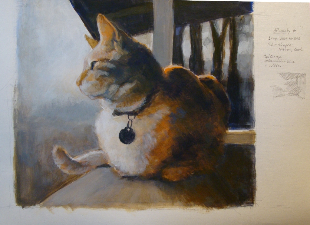
Study for Cat 66, Tiger on the porch


Study for Cat 66, Tiger on the porch
canvas paper

   The first new work of the year. Many years ago a neighbor's cat, "Tiger" liked to visit and park himself on the porch rail for hours, watching the birds.

I'm attempting a "hard reboot" of my painting habits. Reading through numerous books on landscape painting and composition, I noticed a common theme of  establishing large value masses and a base structure before diving into details; more planning before picking up a brush. I tend to get involved in details far too early in the process, then spend a lot of time later trying to correct problems.
   So, the intent here was to change my usual working process. I tried ignoring the subject matter and just pay attention to the general masses of light and dark, and warm/cool color temperatures. Then made adjustments and added detail.

   This study was a suggested color temperature exercise I found in one book, using only two colors- a warm and a cool, and white for adjusting. I used mixes of Ultramarine Blue and Cadmium Orange.
   The imposed limitation definitely forced me to slow down and put more thought into the composition and mixing color. In spite of slowing down, I completed this in one session.

 I had run across a forgotten a pad of "canvas paper" while cleaning off the shelves, and gave it a try. It's an exasperating surface to work on- it resists the paint until you get a good layer of pigment built up on the surface. OK for informal fiddling around, but I would not recommend it for anything serious.

Sunday, December 31, 2017

I have no new image to post here, but felt compelled to add an entry. For the past couple months I have been going through older, less remarkable paintings and reworking them to figure out different -and hopefully- more successful  solutions. I'm finding this very gratifying, and learning a lot.
  Today, the last day of the year, I summoned up the courage to tear apart my work room and hauled out storage boxes of paintings and drawings that go well back into the 1970's (and some earlier). Having a fine time sorting through the piles of drawings and prints, culling out the "keepers" and discarding the rest into a recycle bin.  I found a lot of canvases that I will dismantle and stretch with new canvas. I have taken digital shots of most of it, so I can always look at those, if I feel the need to look back.
I'm looking forward to having more space to work in, and get started on some new works.
Happy New Year tomorrow! I'll be spending part of it continuing to sort and purge.

Monday, August 7, 2017

Cat 65


 Cat 65, by the window
Acrylic on canvas. 12" x 14".

 This was from a shot taken years ago in 2012- the lucky cat does not show the aging process in photos the way I do. I liked the way her head was facing the opposite direction from her body.

After spending time reworking older paintings, this painting was done with the intent of using what I learned by doing the reworks. I had this more or less completed in four short sessions, then fiddled with it off and on for months, adjusting the background (lighter, darker, intense, neutral, etc), as well as changing angles here and there... had a little fight with the table surface and perspective of box lid, and another battle with the coat color patterns.
I was irked about the placement of the box lid so tight to the bottom edge of the canvas, and resolved that by reducing the contrast on the box, allowing it to blend more with the background.

There is a solution to this, but time to move on to something else. I will come back to it later. The tabby-tortoiseshell fur is definitely a challenge.

Friday, July 7, 2017

Chanel

Chanel
Acrylic on canvas. 12" x 14".

 An attempt at painting a Shih Tzu. This is my niece's dog, cooling off on a tile floor in Rio.

I limited the colors to the three primaries- Cadmium Yellow Light, Cad Red Medium and Ultramarine Blue. The floor was laid in as a mixed orange, then scumbled over with a blue and white mix, toned down with orange added. I washed over the tiles in the back with a thin layer of raw sienna to drop the intensity and push them back more. I had hoped for more orange tones to bleed through, but didn't pull it off.
With more time, I would have worked the tiles more, soften some of the edges and beef up the different fur directions. But in general it came out okay. I was told it looked like her.

Sunday, January 22, 2017

Rework of Cat 28


Rework- painting over Cat 28.
The original painting (below) was done in 2013.
I could not locate the shot I had worked from, so I found a few similar shots, and worked from those. The only area that didn't get reworked were the books on the desk. My father built that desk in the early 1960's- and I still use it.


Friday, January 20, 2017

Rework of Cat 52

Rework of Cat 52
The original (below) was done in 2013.

A few angles and proportions changed, some hard lines softened, and neutralized some colors. I think this works a lot better,


Rework of Cat 53


Rework of Cat 53.

The original (below) was done in 2013.

This is classic awkward Oscar in a weird, stiff position. I really liked the colorful quilt and hesitated painting over all the fussy detail, but couldn't take the visual chaos.
 I made adjustments to angles and proportions within the cat's body shape, and dropped the saturation/intensity of the colors. It's much less confusing to look at now.

Wednesday, January 18, 2017

Rework of Cat 55

Reworked painting of Cat 55.
Oscar bathing in the corner. The original painting (below) was done in 2013.

I made major proportion and angle structural adjustments to everything, and desaturated the colors to more neutral tones. It would have worked better if the paws had not been so close to the canvas edge- a little more open space down there would help relieve the visual tension.
I thought the one leg pointing at the lower right corner might cause a composition problem, but the edges of the walls seem to pull the eye back into the center. At any rate, its an improvement (I think) over the original. .