Friday, November 13, 2020


Tollgate Farm Cow
9" x 12", acrylic on board

This was done on top of an older, unsuccessful painting so it had quite a lot of texture already built up.
I've been meaning to try working with cows. I like their bony structures and heavy masses.

This was difficult to photograph with the surface reflection and the green pigment. I can't seem to get the colors to show accurately- they aren't as saturated as this implies, and leans more yellow than it really looks.

Wednesday, November 4, 2020

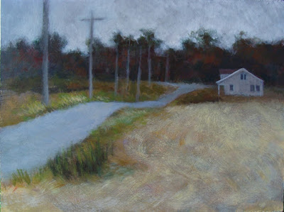
Indiana Farmhouse


Indiana Farmhouse
12" x 16", acrylic on board

My friend Nancy shared photos she took around her area and I was drawn to this shot- as was she. We both ended up painting it, and this is what I ended up with. It was done over an extremely bad painting on Masonite board from 10 years ago and I had since sanded the surface down.
I liked the simplicity of the composition and value masses. I also wanted to push myself to using more visual texture. This was a good start.

Tuesday, December 31, 2019

Shaddy

Shaddy
16" x 20", acrylic on canvas
sold


The challenge of this painting was:
1. working from a shot where a section of the horse was obscured by a persons head.
2. while I drew countless horse pictures as a kid, I hadn't tried painting one.
3. a white(!) horse. How do you paint a white animal? 
 It turns out the fun thing about white/light colors is how other colors are reflected on it, if you look closely enough.
As in the last painting, I had to invent a background. The photo background had possibilities, but too many unfortunate tangents and distracting forms.
 I would have preferred more time to work this out- I would like to see a different textural element defining the ground- as it is, it's too similar to the texture of the body of the horse. The warm/cool patterns got a little too busy!  I would tone down the warm yellow reflection on the horses barrel, which would help push the body back in space.
 These foreshortened angles are still head-scratchers for me.

Sunday, December 29, 2019

Cody

Cody
16" x 20", acrylic on canvas
sold

From a small cell phone shot. I did a preliminary study of this in a square format which I liked, but decided to use a landscape orientation canvas and include more body to offset the subject from being dead centered on the canvas. Although that would have been appropriate for a portrait.

 I had to ditch the Prussian Blue and Yellow Iron Oxide used at the start as they were just too saturated. The dog was beginning to glow in the dark. I switched over to the earth tones- Raw and Burnt Sienna, Ultramarine Blue and Naples Yellow. The background in the reference photo was an unusable interior scene.
Hitting a point of feeling "stuck", and with the panic deadline setting in, I tried something new- I submitted the painting on the dailypaintworks.com critique challenge, hoping for someone else's opinion besides my own. I received extremely helpful feedback, which helped me make some better decisions, and challenged me to come up with an unexpected background!

I learned a lot from working on this one.

Thursday, October 17, 2019

Rambling on color


"Color, A course in mastering the art of mixing colors", by Betty Edwards


Here we are getting the typical fall weather- a succession of strong storms moving in from the Pacific with lots, and lots of rain. Sometimes a steady light drizzle, sometimes a heavy downpour.
This is amuse-yourself-inside kind of weather.

I am reading a book on color theory by Betty Edwards, which expands on her experiences with painting. I am trying some of the color mixing exercises which included creating a circular gray scale for isolating and evaluating different value and intensity levels by laying it over an area of color and matching the relative values through the little punched holes in the wheel. This was more difficult to create than I expected- I adjusted the value segments several times, and still don't have an even distribution.
The color wheels were much easier to do, although I didn't have the suggested paint color to use on the green and the violet sections. I was familiar with lightening a color by adding white, but had not tried darkening down colors by adding black, having been cautioned that would deaden or flatten the color. I'd always just added another dark hue to the mix.

I discovered a whole new range of colors by adding a tiny amount of black to a pure color, or to a simple mix. The paint does not always react the way you expect, due to the chemistry.

I also discovered I am not paying attention to the difference between the lightness of a color vs the intensity of a color.

According to Betty, my brain might be getting in the way of seeing what is really there, a phenomenon she calls "color consistency", where you revert to your early training of coloring the sky and water blue, and the foliage green, and the sun yellow.
Sometimes a problem can be fixed by simply adjusting the value or intensity of a color to work better with the others around it.



Thursday, August 29, 2019

Cat 70

Cat 70, Lizzy
12" x 12", acrylic on board

From a shot taken in 2012. This painting was fast, and I didn't over fuss it for a change.
Again with the goal of softening edges, and brush strokes showing. Worked with the three primary colors: ultramarine blue, cad red light and cad yellow light. And White.
I like the softer approach of neutral colors and lower contrast, with only a few detailed lines.


Tuesday, August 27, 2019

Cat 69 Lizzy in the studio #2

Cat 69, Lizzy in the Studio #2
9 x 12", acrylic on board

Using the same photo reference as the previous painting. In a vertical format instead of square, and the color base is blue and orange (mix using cad red light & yellow light).
This was a response to the ongoing struggle with #68. I wanted to try a different approach, working with a more neutral pallet. Drawing with the paint using a filbert shaped brush resulted in a looser line quality. Still a little rigid, but heading in a good direction.