Saturday, February 10, 2018

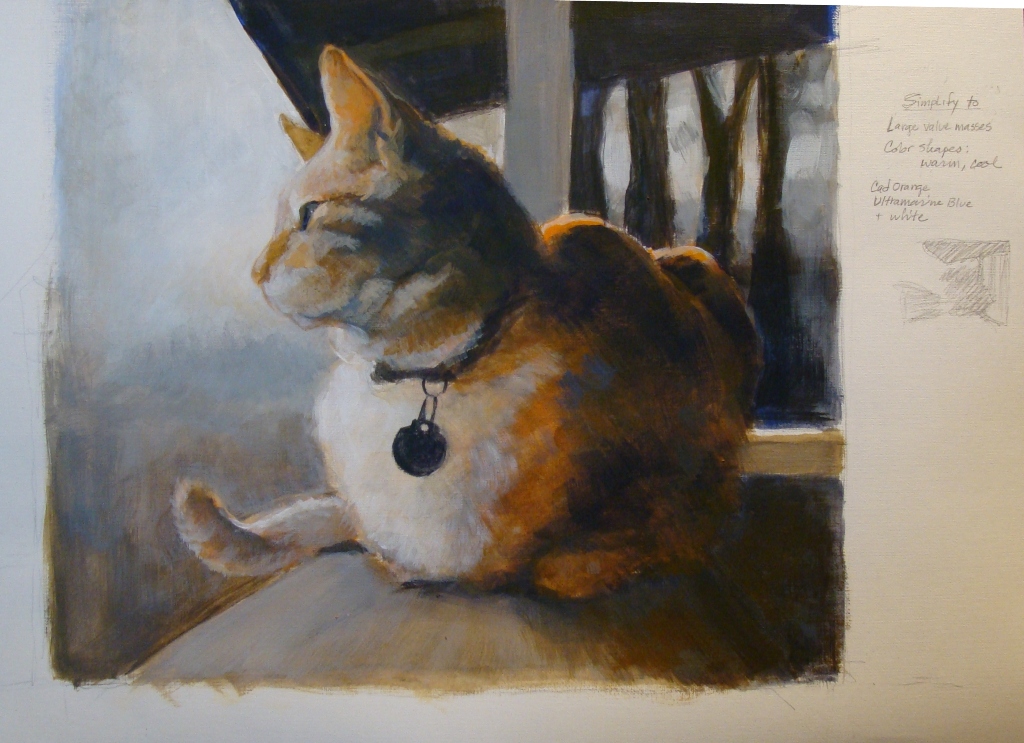
Study for Cat 66, Tiger on the porch


Study for Cat 66, Tiger on the porch
canvas paper

   The first new work of the year. Many years ago a neighbor's cat, "Tiger" liked to visit and park himself on the porch rail for hours, watching the birds.

I'm attempting a "hard reboot" of my painting habits. Reading through numerous books on landscape painting and composition, I noticed a common theme of  establishing large value masses and a base structure before diving into details; more planning before picking up a brush. I tend to get involved in details far too early in the process, then spend a lot of time later trying to correct problems.
   So, the intent here was to change my usual working process. I tried ignoring the subject matter and just pay attention to the general masses of light and dark, and warm/cool color temperatures. Then made adjustments and added detail.

   This study was a suggested color temperature exercise I found in one book, using only two colors- a warm and a cool, and white for adjusting. I used mixes of Ultramarine Blue and Cadmium Orange.
   The imposed limitation definitely forced me to slow down and put more thought into the composition and mixing color. In spite of slowing down, I completed this in one session.

 I had run across a forgotten a pad of "canvas paper" while cleaning off the shelves, and gave it a try. It's an exasperating surface to work on- it resists the paint until you get a good layer of pigment built up on the surface. OK for informal fiddling around, but I would not recommend it for anything serious.

Sunday, December 31, 2017

I have no new image to post here, but felt compelled to add an entry. For the past couple months I have been going through older, less remarkable paintings and reworking them to figure out different -and hopefully- more successful  solutions. I'm finding this very gratifying, and learning a lot.
  Today, the last day of the year, I summoned up the courage to tear apart my work room and hauled out storage boxes of paintings and drawings that go well back into the 1970's (and some earlier). Having a fine time sorting through the piles of drawings and prints, culling out the "keepers" and discarding the rest into a recycle bin.  I found a lot of canvases that I will dismantle and stretch with new canvas. I have taken digital shots of most of it, so I can always look at those, if I feel the need to look back.
I'm looking forward to having more space to work in, and get started on some new works.
Happy New Year tomorrow! I'll be spending part of it continuing to sort and purge.

Monday, August 7, 2017

Cat 65


 Cat 65, by the window
Acrylic on canvas. 12" x 14".

 This was from a shot taken years ago in 2012- the lucky cat does not show the aging process in photos the way I do. I liked the way her head was facing the opposite direction from her body.

After spending time reworking older paintings, this painting was done with the intent of using what I learned by doing the reworks. I had this more or less completed in four short sessions, then fiddled with it off and on for months, adjusting the background (lighter, darker, intense, neutral, etc), as well as changing angles here and there... had a little fight with the table surface and perspective of box lid, and another battle with the coat color patterns.
I was irked about the placement of the box lid so tight to the bottom edge of the canvas, and resolved that by reducing the contrast on the box, allowing it to blend more with the background.

There is a solution to this, but time to move on to something else. I will come back to it later. The tabby-tortoiseshell fur is definitely a challenge.

Friday, July 7, 2017

Chanel

Chanel
Acrylic on canvas. 12" x 14".

 An attempt at painting a Shih Tzu. This is my niece's dog, cooling off on a tile floor in Rio.

I limited the colors to the three primaries- Cadmium Yellow Light, Cad Red Medium and Ultramarine Blue. The floor was laid in as a mixed orange, then scumbled over with a blue and white mix, toned down with orange added. I washed over the tiles in the back with a thin layer of raw sienna to drop the intensity and push them back more. I had hoped for more orange tones to bleed through, but didn't pull it off.
With more time, I would have worked the tiles more, soften some of the edges and beef up the different fur directions. But in general it came out okay. I was told it looked like her.

Sunday, January 22, 2017

Rework of Cat 28


Rework- painting over Cat 28.
The original painting (below) was done in 2013.
I could not locate the shot I had worked from, so I found a few similar shots, and worked from those. The only area that didn't get reworked were the books on the desk. My father built that desk in the early 1960's- and I still use it.


Friday, January 20, 2017

Rework of Cat 52

Rework of Cat 52
The original (below) was done in 2013.

A few angles and proportions changed, some hard lines softened, and neutralized some colors. I think this works a lot better,


Rework of Cat 53


Rework of Cat 53.

The original (below) was done in 2013.

This is classic awkward Oscar in a weird, stiff position. I really liked the colorful quilt and hesitated painting over all the fussy detail, but couldn't take the visual chaos.
 I made adjustments to angles and proportions within the cat's body shape, and dropped the saturation/intensity of the colors. It's much less confusing to look at now.