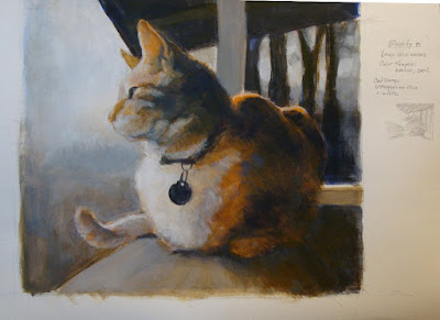
Tuesday, November 20, 2018

Snoqualmie River at Fall City

Snoqualmie River at Fall City
acrylic on board, 12" x 12"

   I dusted off my collection of oil paints from the 1970's, and spent a considerable amount of time prying lids off the tubes and cleaning up the threads and caps. Most of the tubes were not salvageable, especially the ones where the lids had popped off over time, but a few were still pliable after all these years. I'm baffled as to how the lids had come off, as they would have to be unscrewed. I have some suspicions of sabotage.

My first mistake was to set up inside to work from a digital photo taken at the river on the old IBM computer. After applying a thin wash over the board, the fumes from the "odorless" mineral spirits and lavender spike oil drove everyone out of the house.
After moving all my supplies outside to the covered porch, I returned to open windows and set up a box fan to clear out the fumes. Oops.
I continued working on it outside by using a small printout of the photo for reference.

Mistake Number 2: I picked up a couple more tubes of paint from a local inexpensive craft store. The low end paint had very little pigment, and excess oil, making it very difficult to mix successfully with the older but better quality paint.

The oils have more resonance - for lack of a better term. The seem richer and deeper in color than the acrylics. If the solvents weren't so overwhelming, I would switch to using this medium in a heartbeat. But for now, I will have to limit them to outside only. Or try using them without any thinners.

Saturday, August 4, 2018

Ebony

Ebony
acrylic on board, 12" x 12"
Sold.

   This is Nancy's dog, Ebony; a Cavalier King Charles spaniel. I think. I've never actually met her.
 I meant Ebony, not Nancy.

I'm still sticking with a limited palette strategy: this was done using four colors, plus black and white.
The wood panel was toned with a wash of Raw Sienna. After roughing in the dogs form with pencil, I built the value masses.
 The darker areas are mixes of Raw Umber & Ultramarine Blue, later overlaid with Mars Black.
 The lighter areas are Raw Sienna with a touch of Ultramarine Blue & Titanium White.
 Burnt Sienna was added to create the more intense warm browns on the legs.

 I added mixes of Ultramarine Blue to the washed background. There is a wee bit of Dioxazine Purple mixed into the cast shadow. I'm now wondering if I should have worked a little purple somewhere into the background to create more unity. But it's also fine as it is.


Sunday, March 25, 2018

Cat 67 Mrs R

Cat 67, Mrs Roosevelt on the porch
11 x 14", acrylic on canvas

Mrs R has been gone well over 15 years, but I have plenty of photos of her. She was not particularly attractive, but had a dynamic personality that more than made up for her looks. I may have glamorized her a little bit- she would be pleased.

I had two objectives with this painting:
 arriving at a good composition for the canvas shape, and,
 working with warm and cool temperature colors to convey depth of field.

I'm finding the standard canvas dimensions often do not work with the crop I have in mind. In this case a square format would have been best. I worked around that by creating a square through  utilizing the post in the foreground- I think it worked out well.
I also achieved a nice mix of hard and soft lines. I may sharpen the whiskers more.

I still need to figure out how to get around the "fish-eye" distortion when shooting these.  The post appears to be curving, but my trusty ruler tells me it is not.

Saturday, February 10, 2018

Study for Cat 66, Tiger on the porch


Study for Cat 66, Tiger on the porch
canvas paper

   The first new work of the year. Many years ago a neighbor's cat, "Tiger" liked to visit and park himself on the porch rail for hours, watching the birds.

I'm attempting a "hard reboot" of my painting habits. Reading through numerous books on landscape painting and composition, I noticed a common theme of  establishing large value masses and a base structure before diving into details; more planning before picking up a brush. I tend to get involved in details far too early in the process, then spend a lot of time later trying to correct problems.
   So, the intent here was to change my usual working process. I tried ignoring the subject matter and just pay attention to the general masses of light and dark, and warm/cool color temperatures. Then made adjustments and added detail.

   This study was a suggested color temperature exercise I found in one book, using only two colors- a warm and a cool, and white for adjusting. I used mixes of Ultramarine Blue and Cadmium Orange.
   The imposed limitation definitely forced me to slow down and put more thought into the composition and mixing color. In spite of slowing down, I completed this in one session.

 I had run across a forgotten a pad of "canvas paper" while cleaning off the shelves, and gave it a try. It's an exasperating surface to work on- it resists the paint until you get a good layer of pigment built up on the surface. OK for informal fiddling around, but I would not recommend it for anything serious.

Sunday, December 31, 2017

I have no new image to post here, but felt compelled to add an entry. For the past couple months I have been going through older, less remarkable paintings and reworking them to figure out different -and hopefully- more successful  solutions. I'm finding this very gratifying, and learning a lot.
  Today, the last day of the year, I summoned up the courage to tear apart my work room and hauled out storage boxes of paintings and drawings that go well back into the 1970's (and some earlier). Having a fine time sorting through the piles of drawings and prints, culling out the "keepers" and discarding the rest into a recycle bin.  I found a lot of canvases that I will dismantle and stretch with new canvas. I have taken digital shots of most of it, so I can always look at those, if I feel the need to look back.
I'm looking forward to having more space to work in, and get started on some new works.
Happy New Year tomorrow! I'll be spending part of it continuing to sort and purge.

Monday, August 7, 2017

Cat 65


 Cat 65, by the window
Acrylic on canvas. 12" x 14".

 This was from a shot taken years ago in 2012- the lucky cat does not show the aging process in photos the way I do. I liked the way her head was facing the opposite direction from her body.

After spending time reworking older paintings, this painting was done with the intent of using what I learned by doing the reworks. I had this more or less completed in four short sessions, then fiddled with it off and on for months, adjusting the background (lighter, darker, intense, neutral, etc), as well as changing angles here and there... had a little fight with the table surface and perspective of box lid, and another battle with the coat color patterns.
I was irked about the placement of the box lid so tight to the bottom edge of the canvas, and resolved that by reducing the contrast on the box, allowing it to blend more with the background.

There is a solution to this, but time to move on to something else. I will come back to it later. The tabby-tortoiseshell fur is definitely a challenge.

Friday, July 7, 2017

Chanel

Chanel
Acrylic on canvas. 12" x 14".

 An attempt at painting a Shih Tzu. This is my niece's dog, cooling off on a tile floor in Rio.

I limited the colors to the three primaries- Cadmium Yellow Light, Cad Red Medium and Ultramarine Blue. The floor was laid in as a mixed orange, then scumbled over with a blue and white mix, toned down with orange added. I washed over the tiles in the back with a thin layer of raw sienna to drop the intensity and push them back more. I had hoped for more orange tones to bleed through, but didn't pull it off.
With more time, I would have worked the tiles more, soften some of the edges and beef up the different fur directions. But in general it came out okay. I was told it looked like her.